U.S. Bank

Understanding your U.S. Bank mortgage

Challenge

The #1 reason customers contact the call center is to inquire about their recurring mortgage payments. Customers also find it difficult to locate the mortgage educational information.

Intention

Increase customer's "DIY" (Do it yourself) mortgage capabilities and improve CSAT (Customer satisfaction score)

My Role

Accessibility UX Designer

Tools

Figma and React

In a rush? View my team's live U.S. Bank site

Client Goals

  • Reduce customer calls to U.S. Bank call center
  • Simplify access to educational mortgage information
  • Revamp mortgage.com UI and update the images and visuals
  • Projected cost savings: $100k-$125k by offering mortgage self-service options

UX Research

Competitive Analysis:
Mortgage education at other banks

Screenshots of three bank "mortgage pages": Citi.com, Rocketmortgage.com, and chase.com

Customer Experience (CX) Research

Engaged in comprehensive CX research with 50 diverse participants to evaluate the effectiveness of the mortgage design solutions. Collected performance metrics data on user interactions and satisfaction levels using the Visible plugin.

Contact me to see U.S. Bank research

Landing Page Redesign

The redesign involved updating the website to align with the latest U.S. Bank style guidelines and incorporating new accessibility standards. The changes included updates to layout and components, all informed by insights gained from user testing to enhance both usability and compliance with accessibility requirements.

Original Design
(Hero Image Section)

Screenshot of U.S. Bank hero image section with the header "We've made big improvements to your mortgage experience.

The Redesign
(Hero Image Section)

Screenshot of U.S. Bank hero image section with the header "Manage my mortgage: Understanding your U.S. Bank mortgage".
What changed?

Clickable "Action Cards"

three clickable action cards for payments, escrow, and payoff

Original Design
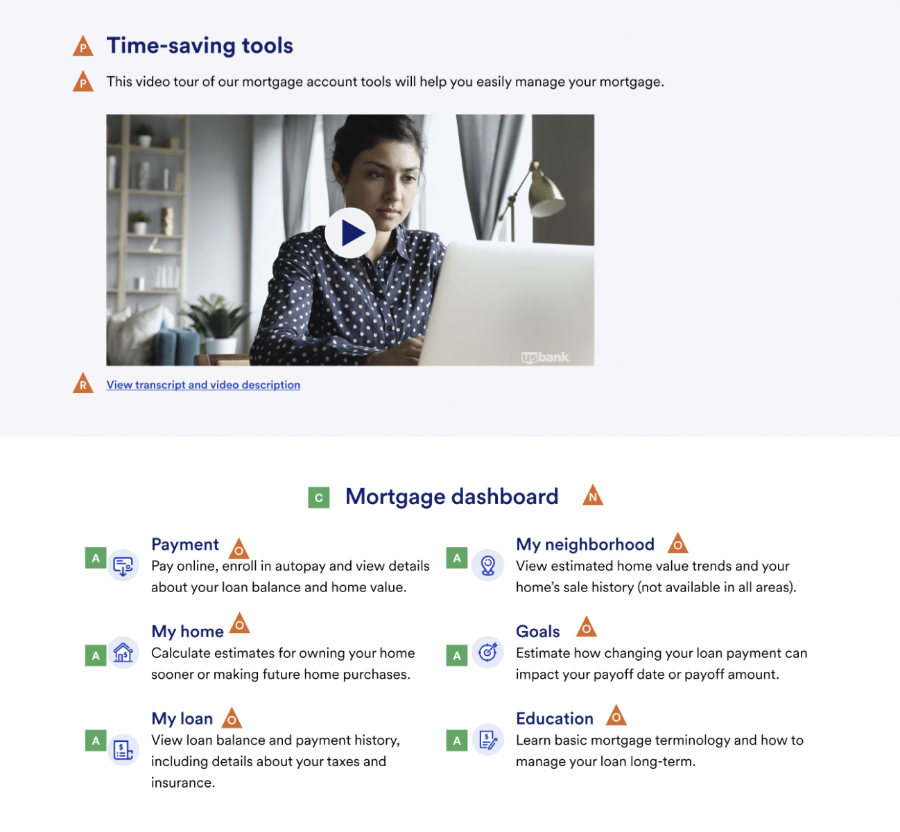
(Time-Saving Tools)

Screenshot of "time saving tools" video and the user mortgage dashboard.

The Redesign
(Time-Saving Tools)

Screenshot of "time saving tools" video with video player buttons and transcript link and the user mortgage dashboard.
What changed?

Updated video thumbnail

side-by-side before and after time saving tools video thumbnail image

Original Design
(Frequently Asked Questions Section)
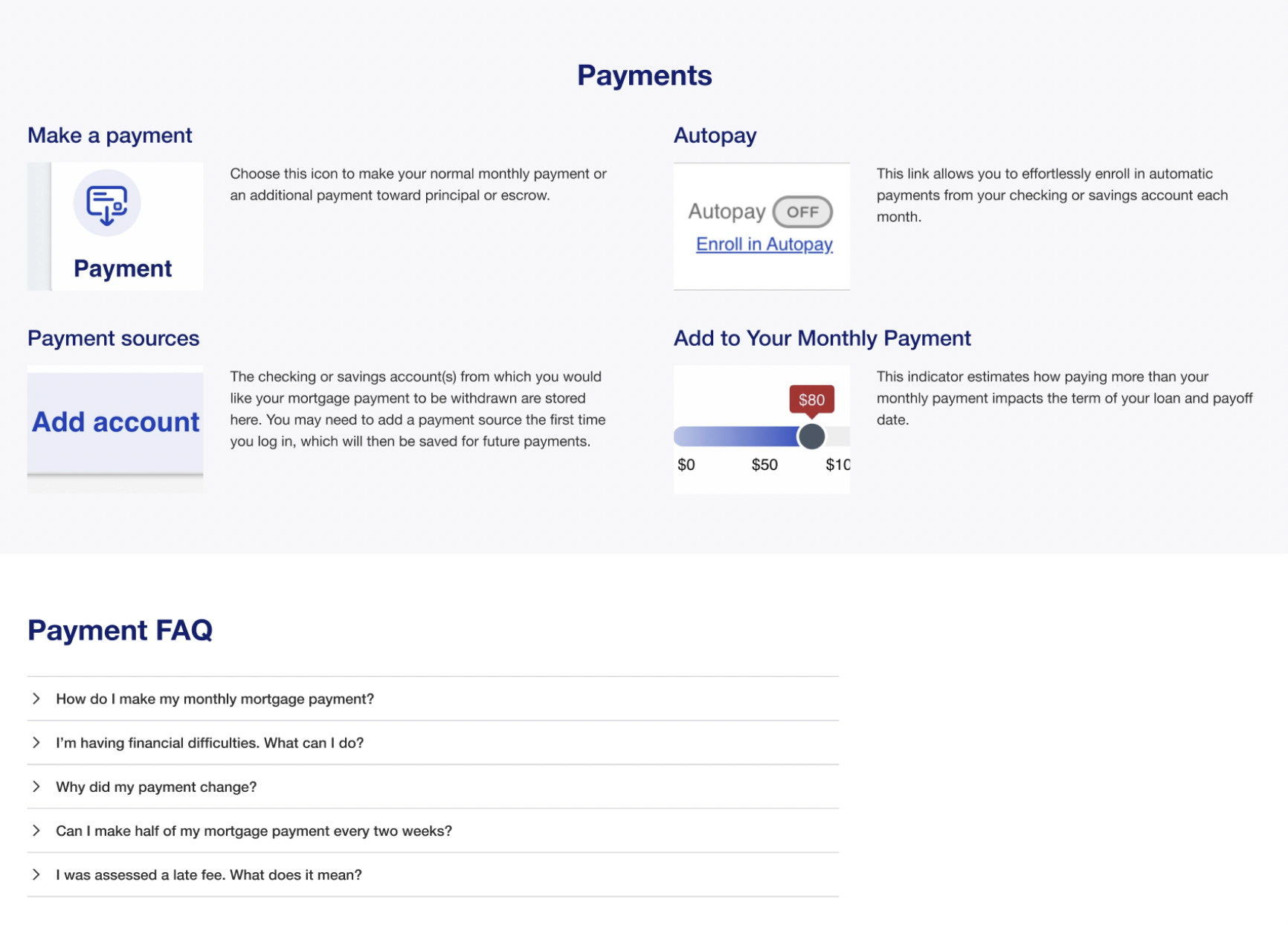
Screenshot of "payments" section with payment quick links and the "Payment FAQ" section

The Redesign
(Frequently Asked Questions Section)

Screenshot of "frequently asked questions: Get answers you need about your U.S. Bank Mortgage" and details
What changed?

Design Annotations

Each element on the page is annotated to ensure developers implement accessibility requirements correctly and create seamless, cohesive interactions.

Screenshot of "manage my mortgage" content annotations in Figma
Screenshot of Figma annotations for the mortgage dashboard

Accessibility (A11Y) Wins

Cognitive A11Y Improvements
Increased white space to reduce cognitive load
"Quick links" and search feature decrease reading time
Acronym "FAQ" changed to "Frequently Asked Questions"
Screen Reader Improvements
Design now meets WCAG 2.1 requirements
Images of text were removed ("Payment" section)
All icons coded as decorative  
Low-Vision A11Y Improvements
All elements have a color contrast ratio of at least 4.5:1
Link style color changed from light grey to bright blue  
Screen Magnification users considered in new layout  
View more of my work